Whilst neutral paint colours have been floating around for quite some years, not everyone seems on board with the idea. So, we would like to pose the question, what comes to mind when you hear the word ‘neutrals’? Do you think of neutrals as harsh cool tones like grey and black? Or uninspiring sterile colours like beige and white? Perhaps the word ‘neutrals’ may even serve as a painful reminder of your last visit to the doctor (we hope not)! However, there’s actually a lot more to neutral paint colours than what meets the eye. On one hand, there are soft dreamy creams that add warmth to any space, and on the other hand are daring rusts, which are bold and beautiful paint choices that speak a million words. Either way, the neutral paint spectrum is both vast and exciting!
But before we get into the trending neutrals, let us remind ourselves of the year we’ve had, and the lifestyle changes we’ve had to make. With global lockdowns forcing more and more of us to adapt to working from home, our homes have evolved. Previously, our homes were spaces that were meant for rest and respite, but now they also serve as our workspaces. Perhaps an unwelcomed edition to the sanctuaries of our homes.
But..
This is where this season’s neutrals come into play! Warm tones create a cozy environment that pulses with life. Soft muted colours inspire a calm serene atmosphere, just like a breath of fresh air. In this article, we hope to inspire you with some of the most fashionable neutral colours 2021 has to offer.
Grey
Greys have always been in fashion over the years, and 2021 is no exception. This season has seen a rise in the popularity of warmer grey tones, replacing last year’s cool greys. This light warm greige provides the perfect clean backdrop for other colors, and instantly makes any space feel large and airy.
Try painting your living room with this light greige to give it an instant facelift. It will reflect light, making your home feel more spacious. Pair it with muted colours for a classic timeless look, or accent it with bold vibrant colours that express your personality.
Alternative to black
A softer alternative to black, this deep earthy brown will contrast nicely against light neutrals and muted colours. It adds that final touch of elegance to any space. It also provides a depth that evokes a sense of stability, making you feel safe and secure in your home.
If you want to incorporate this rich colour into your home, try painting your bookshelves this deep brown to add depth without being overwhelming. Likewise, using this colour on your fireplace will contrast with your light walls, while keeping the style classic. When it comes to deep colours like this, always remember, less is more!
Shades of yellow
2021 is the year of pastels, and muted yellow really seems to be making a splash with interior designers. This pale yellow illuminates the spaces whilst blending harmoniously with other neutrals. It creates a cheerfull atmosphere and infuses summer into your home in a sophisticated way.
Try using this colour in place of white to bring life into a dreary space. Dim narrow hallways can be brightened up, just by using a cheery pale yellow instead of a dull white. You’ll be amazed at the difference this simple change can make!
Green
Interior designers have long used green as a way to bring nature into peoples homes, and this light sage green is no different. A beautiful serene colour, it brings the outdoors inside, and connects nature with the urban space. It also infuses a sense of tranquillity into the space, and instantly transforms a cluttered space into a calm peaceful one.
Create a calming environment for your work, by painting your office sage green. Painting an accent wall is the easiest way to bring sage green into your home. To complement your sage green accent wall, add plants and green accent pieces to achieve a harmonious monochromatic effect. Simple, chic and serene!
Brighten it up
First Light was Benjamin Moore’s colour of the year last season, but it has stayed in fashion, and for good reason too. This light gauzy pink brightens up spaces and creates a soft dreamy atmosphere of serenity and optimism. It’s practical as well, as it can be combined with both cool tones and warm tones to achieve different effects.
This colour would work wonderfully in communal spaces, like your dining room or even your living room. Accent it with earth toned tables and chairs, to bring out the warm undertone of the pink for a monochromatic style. Conversely, you could combine it with light greys to subtly contrast the warm undertone of this pink.
Teal
While last year’s colour of choice was navy blue, 2021 has seen teal capture all of our hearts. This cloudy greyish blue is both modern and timeless. It will liven up any space and add a pop of colour in a subtle and sophisticated way.
To incorporate teal into your home, consider painting your kitchen cabinets a medium teal colour. This will add visual interest to your kitchen. Accent the teal cabinets with wood counter tops to balance out the colour.
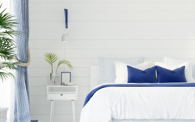
Rosy Peach
Gone are the sterile neutrals of the past. This muted warm rose walks the line between soft and bold. Cocoon yourself with this colour for a comfy and cozy environment. It also pairs beautifully with other warm neutrals, to create a space that radiates warmth and life.
Warm rose really is the perfect colour to paint your bedroom. Earth toned furniture, like wicker baskets and rattan chairs, will complement the warm tones of the rose, and add depth to the colour.
We hope that these neutral colours have inspired you to create an atmosphere that will turn your house into your home. If you feel overwhelmed by all the choices, pick a light colour to use as a base, then pick a deeper colour to add contrast, and finally, choose a brighter one to add a subtle splash of colour. Let your take-home be this; the paint colour you choose should reflect who you are as a person and the way you choose to live.